A SELECTION OF COLORS INSPIRED BY NATURE’S BEAUTY SUPPORTS FLEXIBILITY AND REINVENTION
Publication for the fashion industry, carried out by Pantone Color Institute, Pantone’s color consulting and trend forecasting division, this season’s study presents the 10 colors that stand out the most, as well as the current versions of the five classic colors that are expected with great certainty on the New York catwalks, at a time when fashion designers launch their new Spring / Summer collections.
According to experts at the Pantone Color Institute, as cores of the Spring / Summer 2021 collection in New York emphasize the desire for cores that inspire the capacity for invention and creativity – cores with versatility and that transcend seasons and performance with greater freedom of choice – cores that surrender to originality and flexibility and adapt easily to our new and more fragmented lifestyle.
“The colors for Spring / Summer 2021 are shades extracted from nature, colors that reinforce our desire for flexible shades that work all year. Infused with a genuine authenticity that continues to be increasingly important, as nuclei for Spring / Summer 2021 combined a level of comfort and casualness with sparks of energy that encourage us and elevate our good mood, ”said Leatrice Eiseman, executive director from the Pantone Color Institute.
About the Spring / Summer 2021 Fashion Week color palette New York:
The FCR Spring / Summer 2021 color palette from New York: cores extracted from nature combined with new classic tones come together to create a selection that inspires inventive skill and creativity.
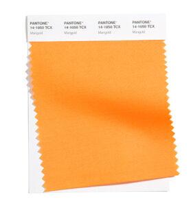
PANTONE 14-1050
Marigold
A comforting yellow, infused with golden orange, brings a warm presence.
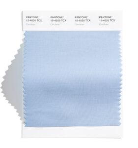
PANTONE 15-4020
Cerulean
The color of the sky on a serene and crystalline day.
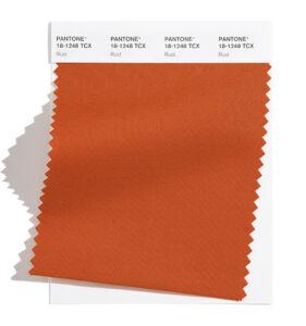
PANTONE 18-1248
Rust
A rust tone inspired by the earth, emblematic of autumn leaves, nothing characteristic of a spring palette.
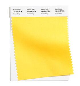
PANTONE 13-0647
Illuminanting
Kind and cheerful, an optimistic yellow brings the promise of a sunny day.
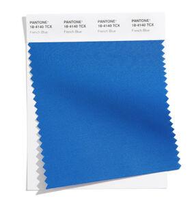
PANTONE 18-4140
French Blue
An exciting blue color that resembles a Paris scene in the spring.
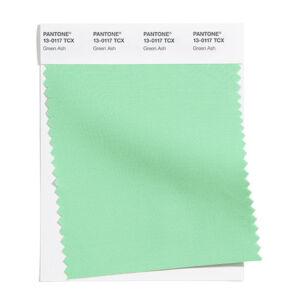
PANTONE 13-0117
Green Ash
A minty green that refreshes and soothes.
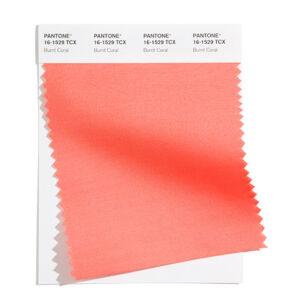
PANTONE 16-1529
Burnt Coral
Burnt Coral is an expressive and sociable invitation.
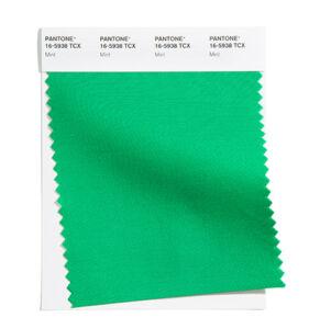
PANTONE 16-5938
Mint
Tasty mint, which refreshes and restores us.
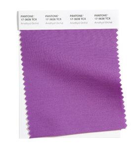
PANTONE 17-3628
Amethyst Orchid
A floral color between amethyst and orchid reveals a unique touch.
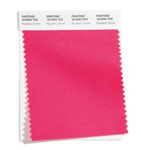
PANTONE 18-2043
Raspberry Sorbet
A life-giving temptation like raspberry sorbet
The new classics for Spring / Summer 2021:
The classic colors of this season are at the same time indicated as solid colors, used boldly, or serve as the basis for a rich color narrative.
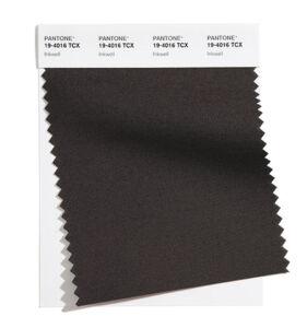
PANTONE 19-4016
Inkwell
A deep, intense and blackish blue.
PANTONE 17-5104
Ultimate Gray
A quiet gray encourages our sense of confidence and durability
PANTONE 11-0110
Buttercream
The smooth Buttercream is a delicious, casual and simple whitish cream.
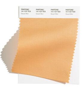
PANTONE 14-1127
Desert Mist
Invoking images of moving sands crumbling into dust.
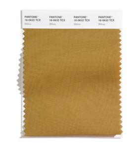
PANTONE 16-0632
Willow
A green canopy that reveals itself and hides itself.
Text and images extracted from the official Pantone website.


[…] and make them the main theme. This part can be challenging, so test the mirror to make sure the colors look great on you. Theoretically, you can choose as many colors as you […]